
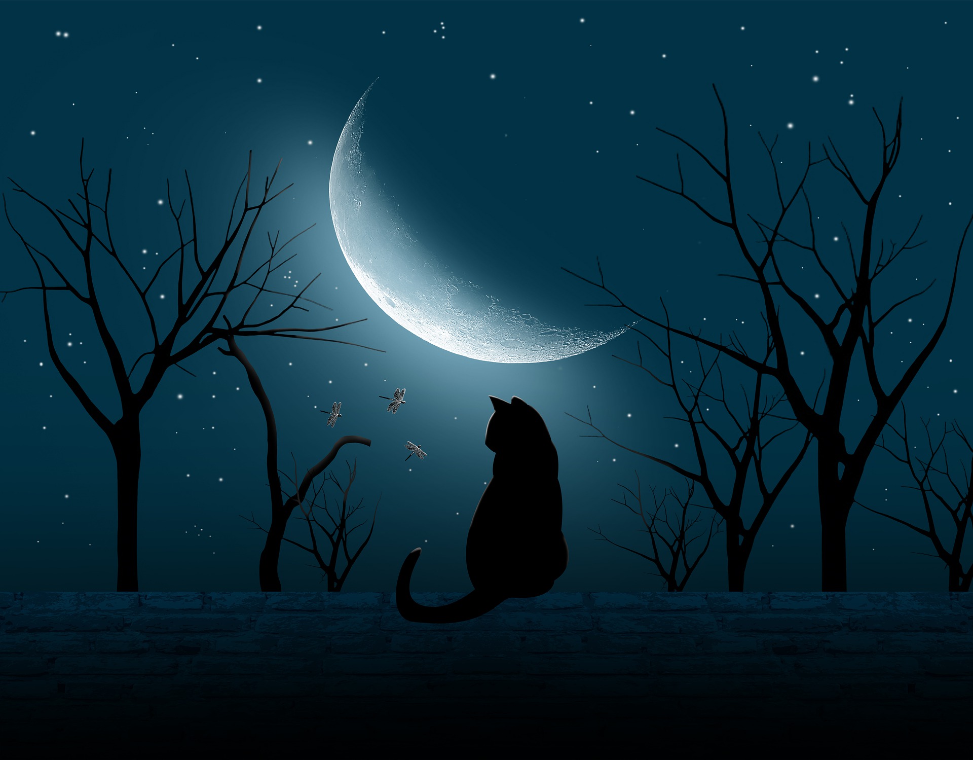
At first glance, this cute little illustration of a cat on a roof in the moonlight is pleasing to the eye. It looks good. But if you take a closer look, you will find a few problems with it. Looking for problems is called being critical.
It’s the same with the majority of illustrations out there today. They give an immediate impression that is good, but after looking closer, mistakes become very clear.
With illustrations, there are styles and techniques that illustrators use to draw attention to specific details, so what might seem unnatural or incorrect, could have been something they did on purpose. So, when we discuss the mistakes, remember that they might not actually be mistakes because they were intentional.
Before you read on and get some of the answers, take a few minutes to closely inspect the image. When you are ready, continue.
Most of the problems I see with this illustration come down to lighting. Lighting is where the light comes from, the way it shines, what it shines on, and where the shadows are. Did you find any lighting mistakes?
The lighting on the cat is good. The whole cat is dark, with a highlight near the moon, which is the source of light. The illustrator wanted the focus to be on the face of the cat to show us that it was looking at the dragonflies, so the brightest highlight is there, though if this were real, the ears would have had brighter highlights.
There is a problem, though. Where the cat meets the roof there seems to be something unnatural. There is no shadow. If the moon is shining on the roof, there should be a shadow. If the moon isn’t, the roof should be as black as the cat with some highlights at the top, like the highlights on the cat. The artist might have left the highlights out because they would distract our attention from the cat and dragonflies, so maybe that is not a mistake, but since the roof is much lighter at the top, it seems the light of the moon must be shining on it, which means there should be a shadow under the cat. It doesn’t have to be a clear shadow in the shape of a cat, but a simple darker area would do.
Can you see any other lighting mistakes? The dragonflies are definitely unnatural, but again, I would assume that is on purpose. The illustrator probably wanted them to look that cool. How often do you see dragonflies in the night, anyways? I get the impression these are supposed to be magical dragonflies or something.
I see another lighting problem. Well, it isn’t actually a lighting problem, it’s a logical problem, but in a way it is a lighting problem. You’ll see what I mean when I point it out. Do you see the stars on the dark side of the moon? Do you see how that is a mistake now? You can’t see stars through the moon! The moon is round, and the dark area should be blocking the light from the stars behind it, so the light part of the moon and the dark part of the moon together should make a circle, but this moon must not be round! Either that, or the stars are much closer than we think they are.
This mistake, once you realize that it happens, is going to bother you forever, because it’s a mistake that countless people make. It’s all over the place! Even professional artists and illustrators make this mistake.
Let’s move on to other things besides lighting. A minor problem with the shape of the cat’s tail is obvious. But again, it is minor. How about the shape of the second tree from the left? Part of it looks more like a noodle than a tree. Maybe the illustrator was running out of time and had to draw something quick. It’s definitely not natural.
Did you notice the other trees? Have you counted them? How many unique trees are there? Once your eye opens to this mistake, you’ll see it all over the world. There are only three unique trees. The five trees on the right are exactly the same. Copy, paste, copy, paste, copy, paste. And actually, the tree on the far left is also the same, with some slight alterations. It has the same basic shape (look closely at the three main branches), but it is mirrored, flipped over. So the only unique tree is the one that looks like noodles. A lot of illustration work is copy and paste because time is money, and most people don’t notice. Since I have spent some time making digital art, I have come to see it very easily.
There is another problem with the trees that you probably noticed while looking closely at them. Which tree is farthest away? At first you would think that the small ones are, but look closer. It’s Mr. Noodles again! This is definitely an accidental mistake. The illustrator couldn’t have done this on purpose. It is behind the other, smaller tree, which means that it must be super tall. Think about it, the nearby tree is at least double the height of the house, right? Well, the smaller, farther tree has the exact same size as the closest tree, and the noodley tree is around double its height. That’s four times the height of the house, but it’s clearly a tree that has been dead a long time, so it should have fallen over by now if it is that tall and thick!
It might have happened like this: the illustrator tried to make trees in the scene. He made one, and it didn’t come out good, so he went online, copied a new tree, and pasted it over and over to make all the trees. That would explain why the smaller, better looking tree is in front of the big old noodle.
That’s all the mistakes I can find. At first, I thought the odd shape of the moon was a mistake, but I looked online and found out that the moon isn’t actually round, so a closeup picture of it doesn’t always look round. It is actually a little egg-shaped.
I hope you enjoyed looking at this illustration with a critical eye. You’ll be good at finding mistakes in things if you think critically about everything. It makes it hard to enjoy a lot of things if you just see the problems, but it also helps improve things because you can’t find and fix errors without being critical.